Sunday, 15 December 2013

Exercise : Too much or not enough - Minimal poster

This is the poster i created for my music event with minimal information. I decided to only include the band name, the venue, start time and date as i felt this was the only information that was essential to the event.
For the background of this poster, i used a photograph of the band performing, as i feel it helps portray quite a lot of information that isn't given in text. From this image, you can get a rough idea of the genre of music, the vocalists image; tattoos, cut off shorts, open 'grungy' shirt, beard and floppy mohawk' establish an image of punk rock. The crowd screaming with their arms in the air, the singer almost stood on top of them, reaching out to them swinging his mic shows that this is going to be an energetic show and a good time. It portrays very well, i think, the raw energy i previously said i wanted to get across.
I used brightly coloured text over a black and white image to make it pop and stand out more.
I kept the design quite sleek and simplistic as i feel it not only looks good, but it fits in with the bands image.

Exercise: Too much or not enough information

For this exercise, i have been asked to make a series of posters for an event, one with minimal details, one with as many details as possible and a final one based on feedback from the previous two.
I have decided to create a poster for a music concert.
Details that may be found on a poster for such an event are: Band name, support bands, date, time, ticket cost, time doors open, time bands begin, finish time, tour name, promotion company name, venue name, venue address, age restrictions.
The band i decided to use for this poster are a band called letlive. they are a five piece punk band from Los Angeles who refer to their style as 'soul punk' . They are known for their raw energy and their crazy outlandish behaviour on stage, often climbing the venue ceilings. I would like to try and portray this energy in my poster.
The audience for poster would be mainly young adults/ teenagers, both male and female who like to attend concerts and listen to rock music.
To attract this audience, my poster needs to stand out, and portray its musical genre, not look like a generic mainstream pop music concert.

Exericse: Book Cover design - Final designs


This is the final design for the book cover for War of the worlds. I tried to keep it quite simplistic. I include to planets at either corner of the cover, one dark, evil looking planet and the other, bright, the good guys, our planet earth. I used cursive writing for the book title and the authors name as this is a classic style of writing, and looks quite sophisticated. I added the text ' sci fi collection' to the spine so readers are aware the book is part of a collection
I placed the title in a white box, with a black band at the top and bottom, not too dissimilar from those I'd seen of already existing penguin books. I placed this in the center of the cover as i want this to be the center of the viewers attention and i also feel it helps break up the cover design, making quite a plain picture look more visually pleasing and interesting. The way the text is displayed on this book will feature on all three of my cover designs.

The next book i created a cover for was The first men in the moon again quite a simplistic design. I wanted all my covers to look quite similar so it would be visually obvious they were part of a set. They all feature planets in a dark blue, starry sky. All with the same style and positioning of text.
I used a big dark, cold looking moon of my cover design. It is quite cold and lonely looking, representing the fact that nobody/ nothing lives or is present on this planet. Before the two characters in the book, nobody had been there, they were the first men in the moon. i did the moon quite big so it was slightly overwhelming, giving a representation of the sheer size of the moon, and vast space/ universe we live in.


The final book in my collection is A modern utopia. Again with a similar design to the others to represent it being part of the sci-fi alien based collection i have created. This cover features a mysterious planet, a utopia, on a cushion. I have used a red cushion with gold trim, similar to royal cushion that carry jewels or other precious objects. This connotes that whatever is on this planet is precious, beautiful, highly valued, rich. A utopia.


Exercise: Book cover design - Research continued

As i was about to start creating my design ideas on my computer, it suddenly struck me, my design ideas might not fit in with the style of those released by the publisher i have decided to use.
As part of the design task, i have to include a publisher name and there trademark. I decided i would use penguin as they release a lot of classic books by old authors, as part of their penguin classics, and H.G.Wells being one of the most acclaimed authors of the 20th century i thought this would be quite fitting.
The classic penguin books all seem to have a similar of cover and i thought, realistically, would this publisher release these books based on my designs? so i thought it best to look at books they have released to make sure my cover is acceptable.


These book all have quite dark, artistic covers . The main feature noticeable on all these books is how the title is displayed. I large black box, with the title and author underneath both in different fonts and colours. There is also a white band on top of this with the publisher logo and name .
I feel it is necessary if using this publisher to display the title, author and publisher on the cover of by books in such a way as displayed here.
I was already aiming for quite a sophisticated, simplistic design for my book covers which is also quite fitting of all the covers displayed here.

Exercise: Book Cover design

For this exercise I have to create 3 book cover designs including the spines for 3 H G Wells books as part of a set. The designs must include the title, authors name, publishers name and trademark.
The Keywords for this brief are: stunning, contemporary, timeless, acclaimed author, relevant, fiction.
My first step in creating the brief is research. I will need to research different H G Wells books, their titles and what they are about I will then need to decide on a way to group these books to create a set. I will also look at previous designs for H G Wells book covers to get inspiration but to also make sure i create something different and i will look and how, if at all his books have been grouped before.
 Using the website www.goodreads.com i began looking at the different books H.G.Wells had written and read the brief description about what they were about so i could begin to group the authors books. I tried to group these books by themes running within the story lines.


 I then tried to look at books that had been grouped before and how they had been grouped as i did not want to do what had already been done a thousand times over. I narrowed by themes down to two possible ones i would use; utopia and aliens. I the made a mind map of the two and the books i could include focusing on keywords on what the books were about, and things that came to mind when thinking of those themes to try and get an idea of what i could include of the book cover designs.

 I decided the three books I'm going to use for my set will all include the theme of aliens somewhere within the story, and so the books i am using are: War of the worlds, First men in the moo and A modern utopia.
Using the keywords from the design brief, i made another mind map based on H.G.Wells and how i might incorporate such ideas into my designs.


Before i began to sketch rough ideas for my cover designs, i decided to look at book covers that already existed to get ideas, but to also make sure i was doing something different, and not too similar to what had been done before.


I then began to sketch rough ideas of my own based on the research i had already done.


I tried to keep my ideas quite simplistic to keep in with some of the keywords such as timeless, in the hope that my design will always remain relevant, and not 'out of style' but also in the hope the simplicity of my designs will give a sophisticated look suited for such an author.
I tried to make my designs intriguing and visually pleasing for all ages to hopefully attract his already existing audience as well as a new following.


Exercise: Visulaising your ideas - Leaflet designs

I experimented with different folds of leaflets, and where i would put the four pieces of equal text, contact details as well as pictures and anything else that would make a leaflet more visually pleasing and more likely for the viewer to pick up / read.
Here are the different leaflet ideas i came up with;


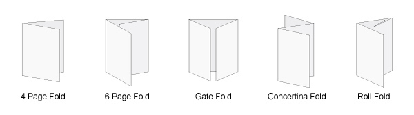
The first leaflet i made was with an A4 piece of paper, i simply help the paper portrait ad folded it in half creating a leaflet with 2 inside pages. I tried to split the text so 2 chunks of text would go on each page with pictures to fill up the gaps, making it look more visually engaging and making the text look less overwhelming.

Inside pages
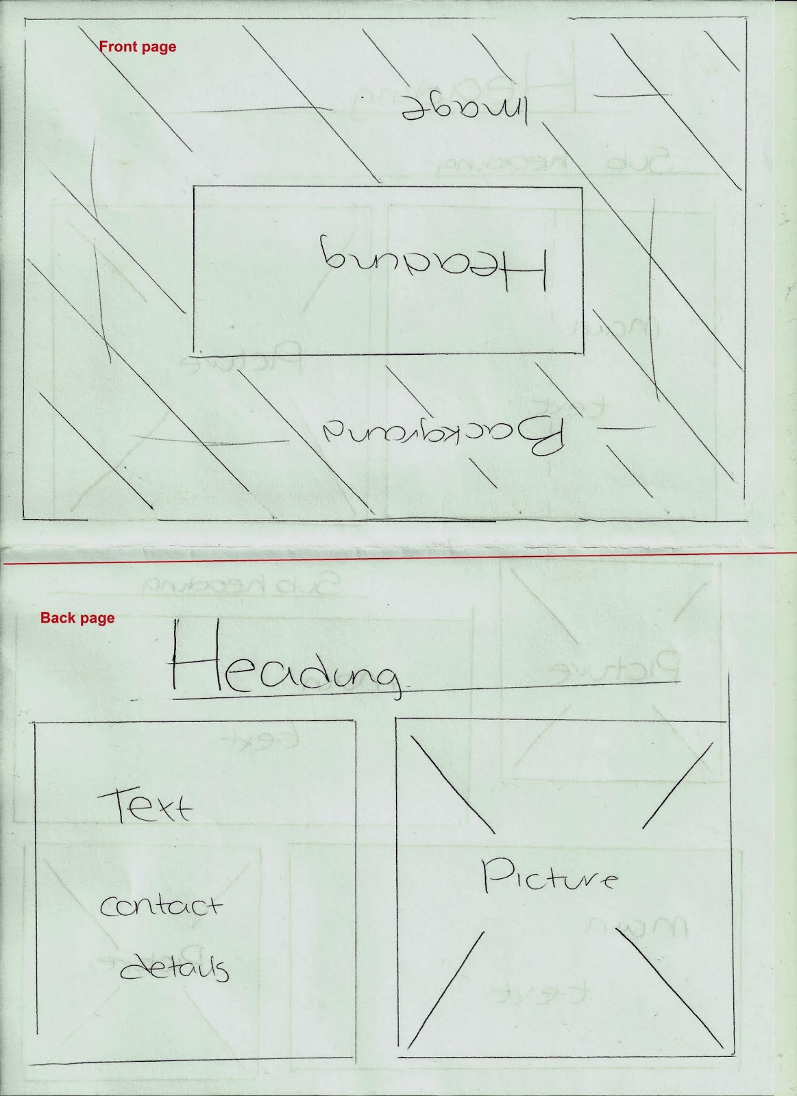
For the front page of this leaflet, i felt an image taking up the entire front page would be quite eye catching, as well as getting the subject across without the use of a lot of words, with a simple heading placed in the center of the page. I put the contact details on the back page along with another image.
Front and back cover

For my next leaflet, i used the same fold but instead held the page landscape.
Again, i put 2 chunks of writing on each of the inside pages.


I put the contact details on the back page and on the front page; a large heading and a picture taking up the remainder of the page.


I then made a leaflet using a gate fold. On the inside pages, there is one large page and 2 smaller side pages. i decided to place 3 piece of text divided between the 2 side pages along with pictures, and a final piece of text, the most important piece of text, in a larger font on the center page, with a large image underneath 

The back page will feature the contact details along with an image. The front pages when closed will have a heading across the top, with a possible tag line underneath and image taking up the bottom half of the page

I used a roll fold to create another leaflet giving me 4 inside pages filled the 2 pages either side of the central inside page with images to break the writing up. I placed 2 lots of text on the very central inside page, and text and a picture on the other side page.

 Again i put the contact details and an image on the back page, and a heading on the front page. I went for a more simplistic approach for the front page of this leaflet and put the heading large to fill up the front page.


I used a concertina fold next, similar to the roll fold, giving me 4 inside pages. I put the heading and an image both taking up 50% of the front page, and a single image on the back page. I then divided the 4 pieces of text and the contact details amongst the inside pages as well as several images.


This time i used a piece of paper larger than A4, A3 ad cut a flower shape out, fitting with the theme of creating a community garden. I put the text on a various different petals within the 2 inside pages. Putting images in some of the petals and leaving others blank. Heading will go in the center of the flowers


I put the contact details on the back page in the center of the flower. No other images or text will feature on this page.
 The other side of the inside pages


The front page features the heading in the center of the flower with no other text or images.

My favourite leaflet style i have created is the last one, in the shape of the flower as it is the most creative, and visually pleasing so far. I personally, would be far more likely to pick up or look at that leaflet than any of the others because of the interesting design shape. other people have also said to me when shown all of the leaflet designs that this one is also their favourite.
Although once the leaflets have colours, images and proper text on them, they will look different, and perhaps thus may change.


Exercise: Visualising your ideas

For this exercise, i have to make a series of leaflets for an event. Finding different ways to display the information. Experimenting with different ways of folding paper to create a leaflet and the various different ways these will be distributed/ displayed.

Before deciding how and where leaflets will be distributed, a target audience needs to be identified.
Who is the leaflet intended for? Where is the best place to find/reach as many people in the target audience as possible? How are you going to attract the audience?

Leaflets can be distributed by hand, either by handing the out to people on the street, or going door to door pushing the through peoples letterboxes or they can be left on display for people to pick up as they wish this may be in offices, shops, schools, community building etc so long as you have permission.

My leaflet is going to be on the topic of building a community garden and so the target audience for this leaflet would be people within the local community.

Creating/ enjoying a community garden may be a nice family activity, a place for young people to hang out and somewhere for elderly people to sit and enjoy and so i want my leaflet to be accessible for all ages and  genders.
I feel the best place to target this audience would be in their own homes and so ideally leaflets would be distributed door to door. Leaflets could also be displayed in local community areas. such as; local coffee shops, convenience stores, hairdressers and community centres etc. all within the local area in an attempt to reach out to as many people as possible within the area.

There are various different ways in which the information can be displayed as leaflet these might be;
a poster, a 4 page fold leaflet , roll fold, z/concertina fold or a tri fold leaflet. These can be displayed vertically, horizontally. Pinned to a wall, on a display stand or handed out to the audience